|
Beautiful Handmade Statement Necklaces and other Fabulousness from Neena Shilvock - Inspirations and Designs From the Week Gone by
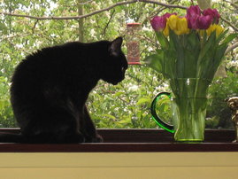
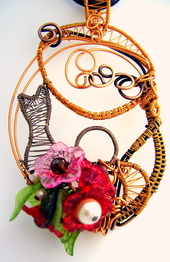
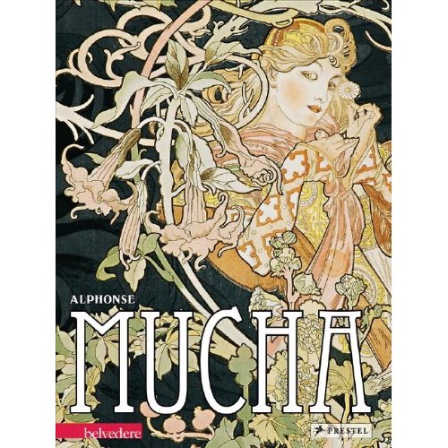
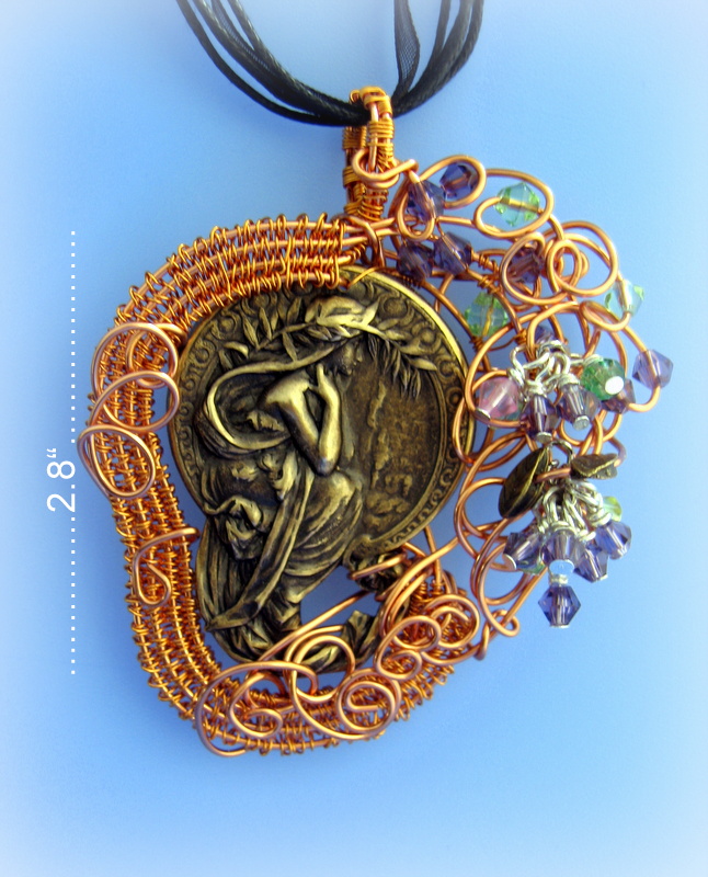
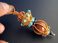
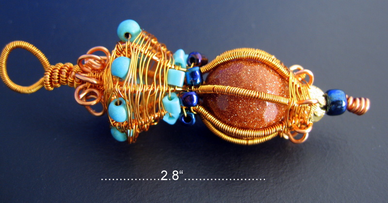
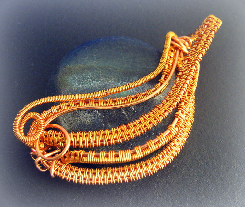
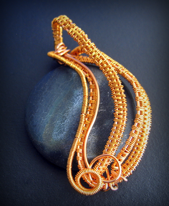
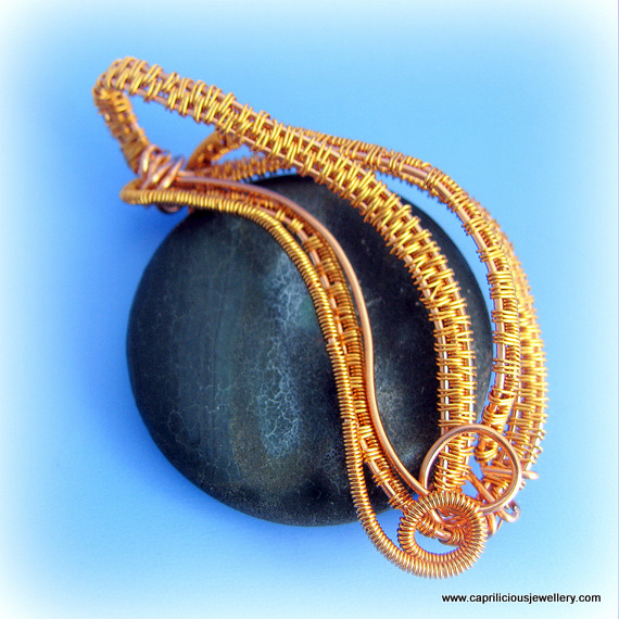
I have been struck by spring fever! The mild temperatures, and the emergence of buds on the trees and little plants coming through the ground in my herbaceous borders are turning me into a happy bunny - all I can think of are flowers and leaves and pretty things. In this mood, I began to populate my new page - The English Country Garden with pieces of jewellery, but in the interim, put in a slide show of pictures taken over the last couple of summers of my own garden - just so people won't be bored if they find themselves on that page. Last week, I made Bluebells, the inaugural piece, and this week, made Chloe, The Cat in the Window, inspired by my own cat Harold, and Wisteria Lane, which of course is the fictional street which is the home of the Desperate Housewives in the TV serial. The central pendant in Wisteria Lane is an Art Nouveau design reminiscent of the paintings of Alphonse Mucha, it was surrounded by a frame of woven wire and tiny crystals, some of which were hung in bunches to resemble Wisteria. Sceptre Sceptre was made to break the mold and to get away from being all happy clappy/ spring has sprungy - a lovely faceted goldstone is at the heart of this piece, with turquoise beads to provide contrast. Design credit - Gailavira.com I am not a fan of designs that use wire as a major feature, almost as if the designer is saying ' look at what I can do' - adding more and more tortured wire, just because they can. To me these wire heavy designs resemble a cats cradle, with no light relief, and if they go wrong, they are very close to junk - I'm sure plenty of people like them, but I'm just not one of them. Eclipse was a piece made using a tutorial by a lady who uses a lot of wire in her designs, but very elegantly, so that miles of wire are woven and curved into organic shapes. I was already doing a lot of weaving, so it seemed logical to take it one step further and see how her designs were translated by my hands. I like the way the pendant looks in the pictures - almost mystical. I am enjoying the photography almost as much as the making of the piece - almost! Design credit - Nicole Hanna Eclipse Carol Robertson was kind enough to email me after she had been looking at the Caprilicious website - she said she couldn't read the wordage on the pages as the fonts were too grey and seemed to merge into the background. I thought I'd change that and see if people liked it any better - the fonts in the main text have all been changed to white, and they certainly show up better on a black background. Do you like it?? - if you have any thoughts, please share them with me, I would be ever so pleased to hear from you. I like the black background - it allows the photographs to stand out better, but I would like people to be able to read the words too - after all they come from me and are part of Caprilicious too.
I have checked the android version, and it shows up with black writing on a white background, for some reason, but it is definitely visible - I worried that if it was changed over to white writing, it would disappear on your mobile phone screens, and I know that some people keep an eye on the comings and goings on the Caprilicious website via their mobiles. That's all for now folks, have a good weekend, and don't forget to tell your friends about Caprilicious, please. I'll be here next week, same time, same place - catch you then. If you read the Caprilicious blog regularly, why not sign up to follow it - all you have to do is to click the 'follow this blog' link by the side of the blog title and it will land in your inbox each week. 'Bye for now xx
0 Comments
Your comment will be posted after it is approved.
Leave a Reply. |
Follow
|
